Case Study
High Street Bank Compare
Find the right savings account to help you get where you want to go.
Case Study
We wanted to design a feature for existing customers to compare from a long list of savings accounts available to them in order to maximise their portfolio and reward them as they deserve. The bank had various permutations of the same account depending on customer loyalty and portfolio size, which made choosing one out of the many options a major issue.
The challenge was to offer a jargon-free and clean experience which removed all ambiguity at the point of making a decision. I set out to create a fully responsive mobile-first application that would allow bank customers to compare and contrast the existing selection of savings accounts on offer.
As the Lead UX Designer for the bank's savings account delivery team, I was heading up this project from the very beginning. I collaborated with a wider research team who assisted in our initial research efforts and subsequent user testing, constantly cross checking design work along the way.
From research through to pre-build phases, I worked very closely with business analysts, the product owner, our visual designer and of course, our users. The delivery team included frontend and backend developers for the subsequent build and integration, coupled with a dedicated developer-in-test engineer.
Every UX process has to start somewhere and in our case it was our users who had gotten the ball rolling. For some time there was a demand for more simplified account displaying, which translated essentially into less banking jargon and fewer amount of accounts to choose from.
The research team and I had contacted around 40 users aged 18-65 to find out more about the accounts on offer to them. As part of enhancement work to the existing platform, we held brief interviews focusing primarily on their overarching needs and pain points hindering their experience.
From this analysis we corroborated popular demand to simplify savings accounts and set out to put some low fidelity designs together for initial concept validation.
I started off with some hand-drawn sketches trying to validate some core design thinking that would incorporate the bank's existing pattern library. From the start, it seemed like this project was going to generate new patterns and interactions (as this functionality was new to the bank), although these were discussed on a weekly basis in our UX meetings with the wider design teams.
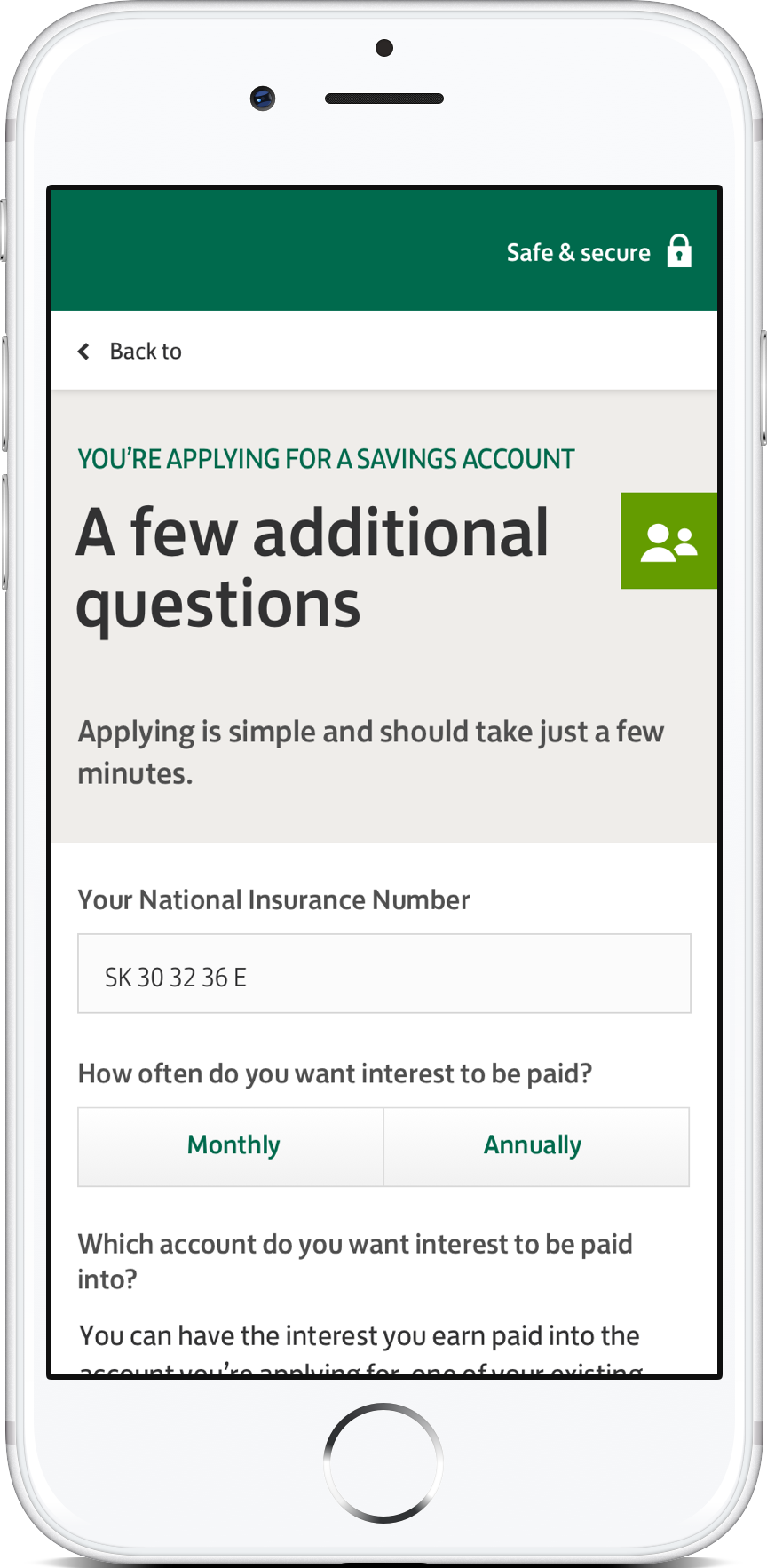
One of the biggest issues I encountered was trying to simplify the product content displayed upfront. For various legal and compliance reasons, there was an absolute minimum that had to be displayed. One of the alternatives I explored was by progressively disclosing extra features that were not required on load, rather revealed by users.
This was a key interaction that was validated during our lab tests and user consensus was that the UI seemed more digesteable with the extras tucked away.

Sketches turned into digital wireframes which then turned into more detailed wireframes as our validation was corroborated along the way. At this point, I had proposed to build a fully interactive prototype in Axure for the business team to better understand all the interactions that would be presented to users. Both mobile and desktop versions were created for a subsquent broader test base (for both customers and non-customers) that was already being recruited.
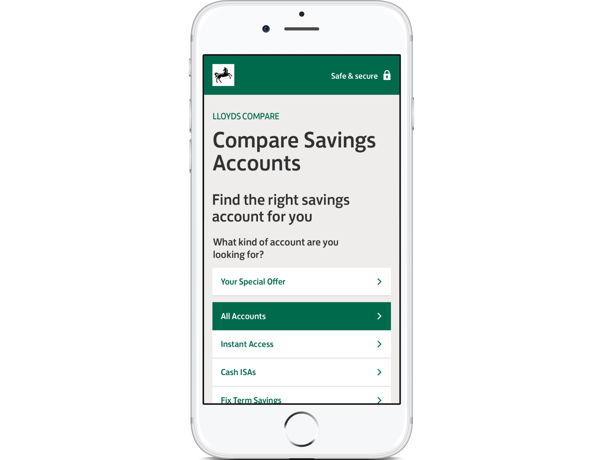
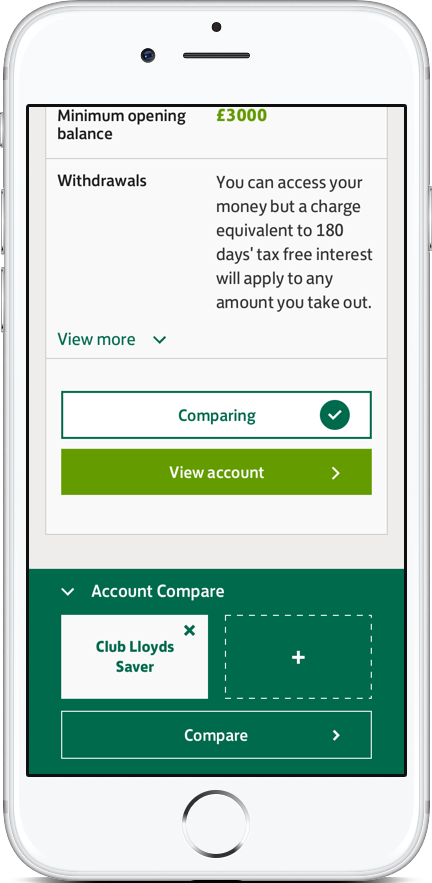
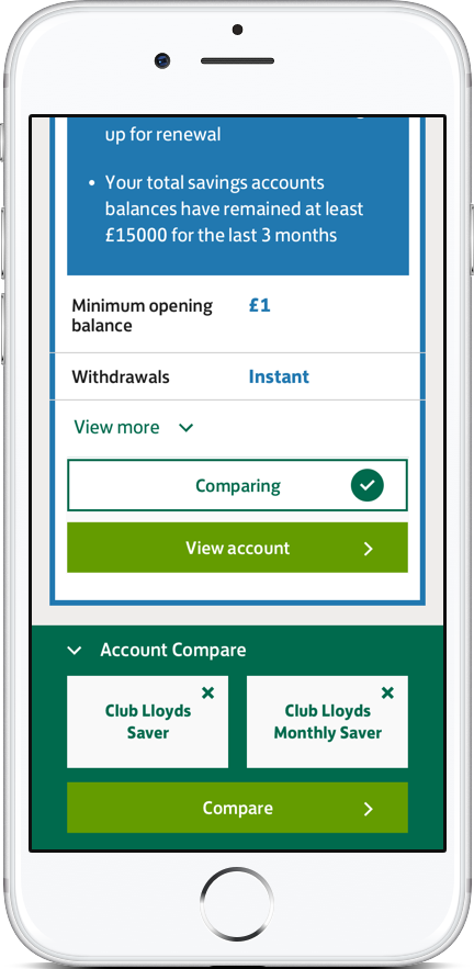
Partial extract wireframe showing a list of accounts

Wireframe showing account one being added to the compare drawer

Wireframe showing account two being added to the compare drawer

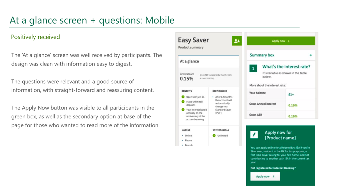
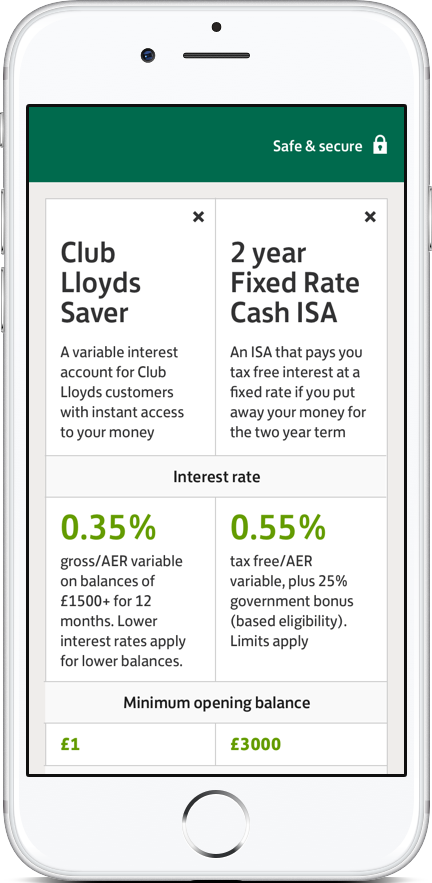
As with projects of this nature, I started with a low fidelity prototype which was briefly tested to validate the core interactions of 'Add to compare' and 'View account'. Once validated, an extra layer of interaction fidelity and visual design was applied as evidenced in the prototypes below.
Our testing schedule spanned over two full days and was comprised of 24 participants - half were Lloyds customers looking for a cross-sell product from their bank and the other half were external customers looking at the different offerings. Both mobile and desktop prototypes were presented to a mix of users with different levels of financial knowledge, although the focus was on mobile as this was the bank's main offering going forward.
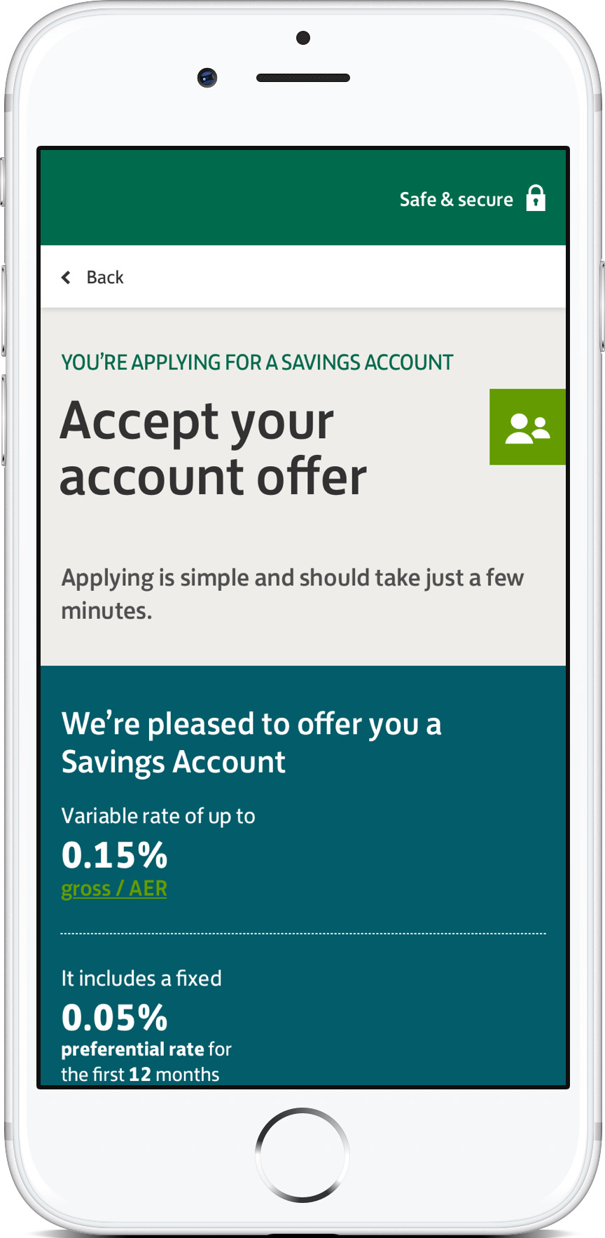
The key issues I encountered during testing were initially flagged during the research phase, where users were often confused with some of the bank jargon used. What do all these numbers mean? What is AER? What's the difference between a standard rate and a diferential rate?
However, the real challenge was how to make the mobile experience more optimisied and friendlier to those less financially savvy. With each test case I learned a little more about the overarching presentation style and how the compare drawer performed. Was the timing of the comparison component correct? What about its affordance to the overall interaction? Did it actually make sense?
Another key issue was when I realised that the labels on both core call-to-actions were misleading to users. I swiftly changed the prototype during our recess session (after consulting with our copywriter) and had both versions retested on the following round of users - the perception of both CTAs was clear and unambiguous.
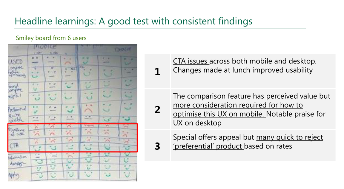
Smiley board findings evidencing CTA labelling issues
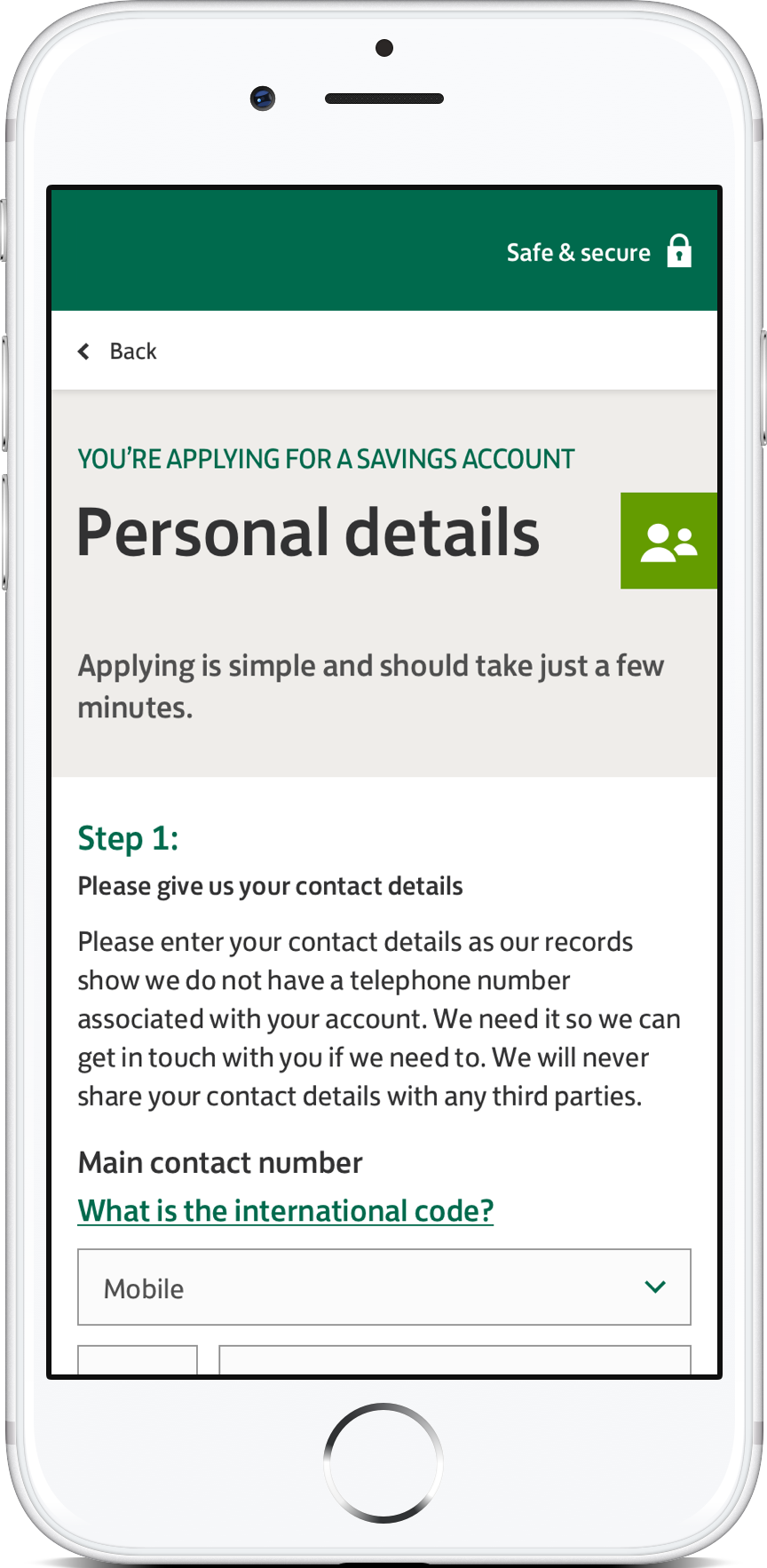
After further discussions with the business team, we thought it would be a good idea to test out the wider 'Authenticated user' journey after users had compared accounts. Some testing had been done in the past but as part of this exercise, I looked at some UX enhancements and incorporated them into our prototypes. New test cases were also created to validate once again a few key patterns used.
Subsequent post-compare journey feedback
During and after every project I tend to write up those little (and not so little) issues and positive points that had a real impact on the project. Its in hindsight that as a designer, I can really look back with objectivity and pick out those moments that made and broke the success of what I was doing at the time. It's an invaluable lesson from both a UX process and delivery perspective as it is a personal one.
Here are some of the key items I've chosen:
I enhanced the customer's experience within their banking portfolio by offering a simple and unambiguous product that would make the world of savings accounts easier to navigate and understand. This unique cross-sell functionality was a first within Savings and was expertely delivered by a highly-proficient delivery team.
Coupled with a more refined set of accounts, the comparison functionality has helped the bank and their customers redefine and enhance their savings portfolio with an increase of accounts and activity among their loyal customer base.